
 UPDATE: Spryke is now on kickstarter! If you want to see this rich universe (and its alphabet) come to life, please support us by becoming a backer! A great way to enhance a gameworld's believability and atmosphere is to make a custom alphabet for it. The written word is all around us, and plays a major role in making our world look and feel the way it does. A unique alphabet helps make a unique gameworld. Anyone who's ever tried designing a font knows how difficult it is. Our brain is very sensitive to disturbances in the flow of readability, and each tiny alteration to curvature or line thickness can mean the difference between elegance and awkwardness. The good news is that the rules are much looser when designing a fictional alphabet, and it can be very fun. But there's more to it than just throwing down some random squiggles. I've recently designed a complete alphabet for Spryke, and I'll take you through my whole process. 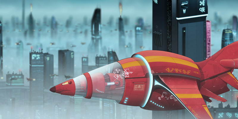 A screenshot from Spryke, showing various uses of its custom alphabet.  Text says a lot even if you don't understand it. It conveys cultural and aesthetic cues, and can evoke familiarity, strangeness, simplicity, complexity, grace, order, and more. The benefits of adding a custom alphabet to your gameFirst off, let's take a look at some reasons you might want to design a custom alphabet for your game.
An alphabet's aesthetic and functional aspects reveal a lot about its creators, its forms naturally springing from the traits of the home culture. Take this ancient alphabet, for example:  Step 1: Consider your gameworld's cultureComprised mainly of sturdy, masculine shapes, these glyphs have a uniformity of size and economy of form that makes them seem almost engineered, rather than merely written. They are solid, upright, efficient. Judging by this alphabet, one could imagine that it was created by a pragmatic, rigid culture that prized order, strength, and structure. And actually, that's not a half-bad description of the ancient Romans. Now look at these characters from another ancient alphabet: These lack the frugality and symmetry of the Latin characters, and are much more complex, intricate, and floaty. One could suppose that the culture that created them was one that cherished sophistication, artisanship, and nuance. Now examine a third ancient alphabet:  These jagged, spiky shapes have neither the balance and structure of the Latin letters nor the grace and complexity of the Chinese ones. Instead, they evoke an aggressive, almost savage vibe. And so they should; they are the Dovahzul alphabet: the ancient language of Skyrim's dragons. Your game's alphabet can and will inform your audience about your gameworld. If your alphabet looks interesting, boring, complex, or frivolous, your game's inhabitants will seem interesting, boring, complex, or frivolous. Use this to your advantage, and make sure that it's communicating the message you want it to convey. 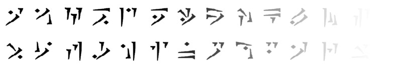 Step 2: Consider your gameworld's technologyApart from looking cool and a little bit hostile, there's another reason the dragon alphabet above is comprised mainly of long heavy slashes: It was carved by dragons. Dragons didn't have pens, brushes or chisels, but claws, and the clever designers at Bethesda took this into account. You may not have consciously thought about these logistics when looting Skyrim's tombs, but you probably noticed it unconsciously on some level. By considering not just the alphabet's personality, but also its logistics, the Bethesda crew designed an alphabet that feels right. There are various technological factors that can influence a successful alphabet. These Anglo-Saxon runes were usually carved into wood, so they avoid curves and horizontal lines (straight lines were easier to carve, and horizontal lines could have caught in the wood grain and split the wood): 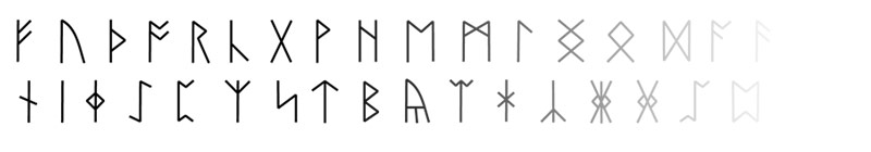 Conversely, this gorgeous Sinhala alphabet from Sri Lanka avoids straight lines and corners. Sinhala was written on fragile palm leaf paper, and sharp corners would have caused tearing. 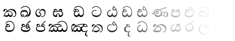 As you can see, technological considerations can have a profound impact on the look of your glyphs. Paying attention to technological logistics won't just make your alphabet more believable, but may take it in an exciting aesthetic direction. Some things to think about:
Spryke is set in a distant planet sci-fi setting, so my alphabet needed to look somewhat modern (as it would most often be rendered by precise machines, just like in our present-day world). It would also need to be alien and unfamiliar, while maintaining an element of fun to suit the cartoony vibe of the game. Step 3: ResearchThere are loads of writing systems on Earth - possibly more than you think. Look through a few of them to get ideas about what your own will look like. 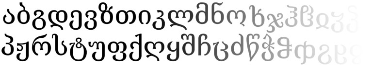 One of my favourite alphabets is this Mkhedruli alphabet (from Georgia) 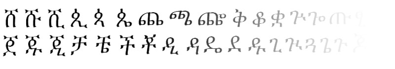 Another favourite is the Ge'ez (Amharic) alphabet, which I first saw on a hand-written letter from my Ethiopian sponsor child. I had never seen it before, and I loved how beautiful and unusual it was. So, do some research and get ideas. Don't forget to check out different fonts where possible, as they may employ different design solutions. After all, a traditional Japanese scroll will have a dramatically different aesthetic to downtown Tokyo neons. But if you're like me, inspiration is just a few centimetres away! 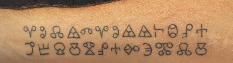 Step 4: Choose your elementsBoth of my arms are tattooed with a prayer written in Glagolitic, an ancient Slavic alphabet. Convenient! Clearly, I have an affinity for this alphabet, and so this is the one I chose as my starting point. Most writing systems are constructed using just a few building blocks, in various combinations. It's a good idea to pick your building blocks before you start designing any characters. This will help you create a cohesive design while guarding you from relying too heavily on the shapes of your native alphabet. Pick a few appropriate shapes that will form the backbone of your alphabet's aesthetic. Remember to peruse existing alphabets for inspiration if need be. Spryke's alphabet needs to look a bit cartoony, and like it belongs to an alien race. My starting point of Glagolitic is actually a pretty good choice, because it's unique looking and looks quite alien to modern eyes, having gone out of usage long ago. In addition, its hollow circle and equilateral triangle motifs lend it a certain geometric look that fits well with my desired cartoony vibe. To make my alphabet a bit more hi-tech looking, I focused on straight lines and precise angles.  I decided my core elements would be equilateral triangles (3 sizes), circles (2 sizes), and angles of 45, 60, 90, and 120 degrees Step 5: PaperNext, I used those elements to doodle several pages' worth of characters, referring to my Glagolitic alphabet (ie. looking down at my arms) as I went. Some characters looked good, others sucked, and most took several iterations to find their sweet spot. 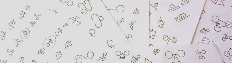 Step 6: Vectorise and finaliseOnce I had loads of characters on paper, I went back through them and circled the 40 or so that had the most promise. I ported these into Photoshop using the vector shape tools (You could of course use Illustrator or some other software). After plenty of fine tuning and iteration, my alphabet finally took shape. I'd created 52 finished characters in all: 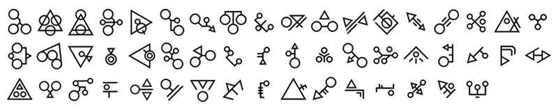 Some things to consider while working on your characters:
Step 7: PunctuationForgot about punctuation, didn't ya? For our purposes, there are two types of punctuation, which I'll call structural and emphatic.
Whether or not you need punctuation at all is up to you, and the specifics of your game. I decided that Spryke won't need structural punctuation, but could benefit from some emphatic punctuation. If you choose to use emphatic punctuation, you must make it somehow decipherable by your audience, even though the rest of your alphabet isn't. There's no point inventing a question mark symbol to replace "?" if people will think it's just another letter. There are several ways to tackle this:
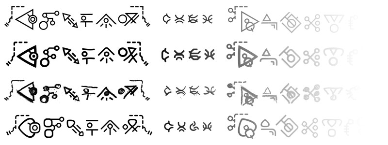
I went with the last option, and made three different punctuation marks. My players won't know what exactly they mean, but the marks should stand out enough to make it clear that they imply emphasis of some sort. Their unique design, raised position, and parenthesis-like clumping of other characters should all help with that. 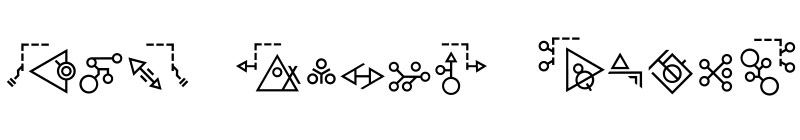 Step 8: NumeralsAs with emphatic punctuation, numerals need to be visually different from your letters. I achieved this in two ways. First, I made them smaller and more uniform in size. Second, I constructed them from different shapes. I exclusively used arcs (incomplete portions of circles), to give them a different appearance from the letters, which were made from complete circles, triangles, and straight lines. 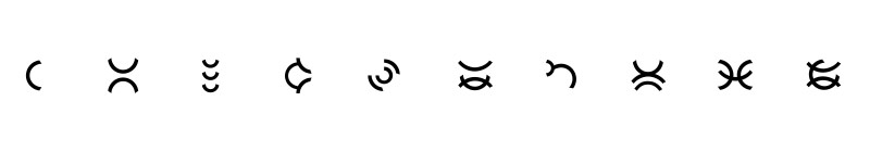 Step 9: FontsI'm writing this in a small home office, yet I can see more than 20 different fonts without even getting off my chair: several across my computer screens, a different one on the logo of almost every appliance and piece of computer hardware in the room, and a few on an old bill on my desk. No matter where you are, I'll bet you'd find plenty of fonts around you too. Our world is loaded with different fonts, and things would look weird if everything was suddenly written in just one. So your gameworld should probably have a few fonts too. Making new fonts won't be quite as time-consuming as inventing your characters was, but it will still take work. I suggest making a few fonts, with specific use-cases in mind. I made four:
 Putting it all together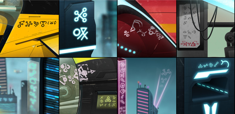 Various in-game elements containing text, with various combinations of letters, numbers, punctuation and fonts. Done! I now have a unique, cohesive, and interesting alien alphabet comprised of 52 letters, 10 numerals, 3 punctuation marks, and 4 fonts (that's 260 characters in total). I can now pepper it throughout Spryke's gameworld as I continue to develop it, confident that I have glyphs to suit any context.
I hope this helps someone, and if you've designed your own alphabet, I'd love to see it! To watch Spryke as it evolves further, like my facebook page.
33 Comments
Oscar
28/11/2014 03:59:05 pm
Thanks for a very well written and interesting article. Using your ideas, it would be an interesting and challenging pastime to develop my own alphabet for "The language used by Angels."
Riley
30/3/2020 05:05:39 pm
Wow, you have no idea how much this helped me! This was so interesting and i made a simple alphabet as well! I am hoping you can do one on a speaking language?
Violet
28/11/2020 04:38:20 am
I really loved the Anglo-Saxon runes! thanks so much, great website.
Someone who stopped by
10/6/2015 10:54:56 pm
Very clear, expressive and well worded. This article goes to the point, yet doesn't refrain from making sure it's understood to the detail. Good job!
7yl4r
14/7/2015 10:09:30 pm
Great article and I'm very fond of your alien alphabet! Would you be willing to share .svg files of your alphabet/fonts and specify a license? I'd love to be able to use them, but will am happy to at least have the inspiration to work from if not. 7/2/2016 06:03:00 am
I would love to know how you actually created the letters. I've been trying to figure out how to create and use it on my computer. If you could kindly give note I would appreciate it!
Terry Miller
2/8/2016 10:54:37 am
It's a picture
ssssssssssssssssssssssssssupeeeerrrrrrrrrrrrrrrrrrrrrrrrrrr
15/2/2016 11:05:16 pm
sssssssssssssssssssssupeerrrrrrrrrrrrrrrrrrrrrrrrrrrrrrrrrrrrrrrr mais compliquer
Adnan
16/2/2016 03:46:38 am
You're fucking stupid don't reply unless you actually have something to ass fuck.
Pissed Off Linguist
13/9/2016 10:32:04 am
Pull your finger out mate: it's super but complicated. Learn to fucking read!
You're Dumb Design 1
15/3/2016 02:38:53 pm
Your time is up saying dumb ass things. Wtf is wrong with all you people. I want a simple ass question and you stupid fucks are just typing random ass bullshit.
Grammar Nazi
13/9/2016 10:34:25 am
It's 'your dumb design', not 'you're'.
Ashton Snapp
22/4/2016 09:27:24 pm
What about Alien phonetics? Considering aliens probably have a different facial structure and different parts their phonetics must be largely different.
Julian
20/11/2016 02:01:33 am
Guys and girls, calm yourselves, seriously. I'm sure that Dave Bleja doesn't want this trash on his website.
Josh Rigby
8/12/2016 10:53:59 am
How did you get from characters on paper to having them on a computer. The image you have in step 6 is very nice but could you explain more the process of getting them into the computer
Dave Bleja
8/12/2016 02:36:59 pm
Hi John,
probably stupid person
9/4/2021 08:43:50 am
how do i make the new symbol so that i can type it out the font
Adam Crouch
30/5/2017 01:43:46 am
hey i have created my own language but needed to put it in my computer for design and insertion for my game thanks for the help
Kaden Dannenberg
8/2/2018 01:40:14 pm
So I am working on a language of my own for a book that I am writing. I really need help making the letters and deciding what sounds that they make. I could easily assign meanings to letters and combinations of letters, I just can't seem to get anything down onto paper that I like. If anybody is willing to help me, I would love to have your help.
gentleman bear
8/4/2018 03:36:04 am
I have the same problem. my suggestion is to look at different fonts and see witch ones you like best. this way you can get to know what stylisation you like. you can also just go with the flow. I like curves a lot so my letters ended up being really curvy. for sounds, you can look to other languages that don't have a written language bassed on latin characters like Arabic, Japanese, Russian, ecetera. you can look at the pronunciations for these characters and see if you like them. well that's all i got for now. ask more questions, I might be able to help
Ali
5/12/2020 10:22:11 am
Its very simple, all you have to do is think big and small. if a say the sound 's' what symbol first pops up in your mind write it down and memorize it. and when you make an alphabet you don't only look at letters from an already made alphabet, you hove to write sounds, because there are some sounds that English doesn't have, or you can make an alphabet where the consonants are written and the vowels are shown in some way, dots, dashes just like Arabic, anything the sky is the limit and you already know the sky doesn't end. So think big and small a lot of people say think big but its the small things that trigger the big thoughts. a large tree comes from a small seed. And don't stress yourself out take break and make sure you are having fun.
gentleman bear
8/4/2018 03:17:48 am
just a kid who wants to make an alphabet for an ancient language in his book 27/2/2020 08:08:00 am
Would it be possible to buy your language download it for my own uses? Thx
Don
16/3/2020 03:02:58 pm
Your alphabet is cool
Selma
22/5/2020 07:10:00 am
Hi! It was a marvelous article, thanks for the info. I have two questions and maybe you may know the answers.
Khaos
27/10/2020 06:21:18 am
Hello, I really enjoyed this site. This is about the twelfth site that I have read on language creation, and I thought that this brought a great perspective.
Khaos
19/12/2020 09:03:30 am
Ofc, anytime
Mark
2/5/2021 03:53:37 am
Randomly found this article because I was looking for a cipher for the alien language in Futurama (Alienese), loved it but wanted something a bit less cartoony and more futuristic for some art im working on. Clicked around and found this article. Then I went about searching through the list of alphabets and writing systems and fell down a rabbit hole! Really inspirational. Thanks so much! Leave a Reply. |
|

 RSS Feed