
|
If you're like many Photoshop users, you might not use Layer Styles much. Or maybe you think that they're only good for cheesy bevel and drop shadow effects. Actually, Layer Styles can be very powerful and surprisingly versatile. In fact, I do almost all of Spryke's graphics using Layer Styles (applied onto vector shapes). Note: This guide is based on Photoshop CC 2014 (the latest version as of writing); minor differences may exist in older or newer versions of Photoshop. 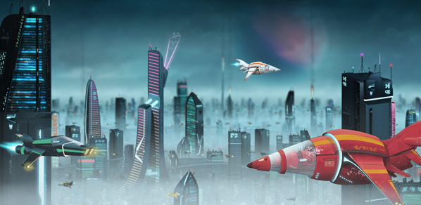 Some 80% of the elements in this screenshot are comprised of Layer Styles applied onto vector shapes. Basically everything except for the sky, fog, and some windows. Quick rehash: What are Layer Styles again?To access Layer Styles, double-click a layer in photoshop. From there, you can tweak various settings to alter the appearance of the layer. Layers that contain Layer Styles have an "fx" icon on them. If you make a Layer Style that you think you'll reuse, you can save it in the "Styles" palette. 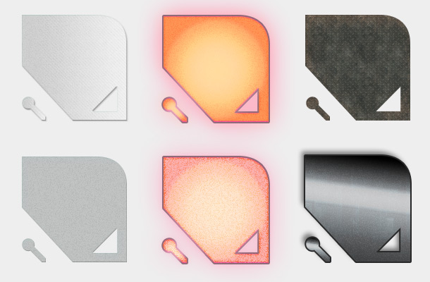 These six identical vector shapes (well, twelve actually, including the little ones in the corners) each have a different Layer Style that greatly affects how it appears. Below is one of the above layers shown with all of its Layer Style attributes. Not every Layer Style needs to be this complex of course, but by stacking multiple attributes like this, you can achieve a great deal of variety and visual subtlety. This particular Layer Style is used for lights and other illuminated objects. It has a round inner glow (from Gradient Overlay), intense coloring (Color Overlay and Satin, both using Overlay Blend Mode), noise (Inner Glow), and a somewhat intense reddish glow (Stroke, Outer Glow, Drop Shadow). 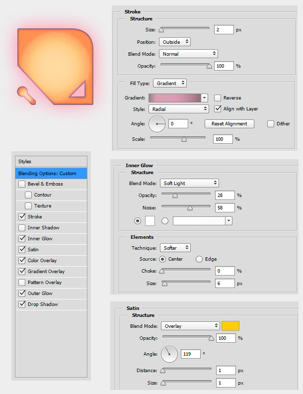 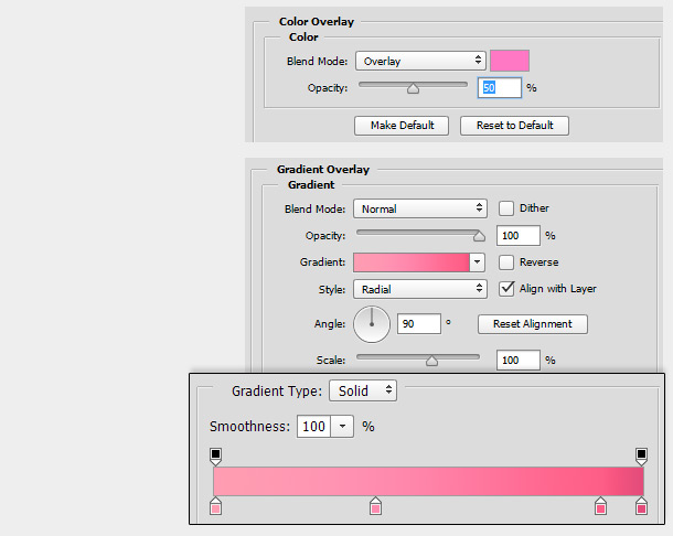 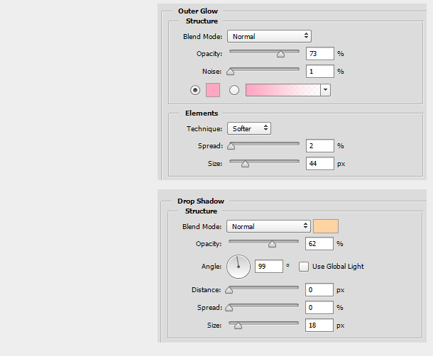 This next Layer Style provides a worn diamond metal plate look. The foundation of the Layer Style is the Pattern Overlay, which provides the diamond plate texture. The colour is first neutralised somewhat (Color Overlay), then intensified (Satin with Overlay Blend Mode). Finally, a subtle degraded appearance is added by a rust-coloured Inner Shadow. 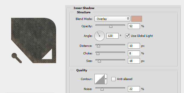 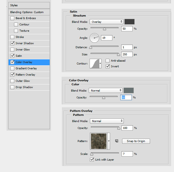 What's the benefit of Layer Styles?There are three main benefits, all of which intertwine: Non-destructiveness I'm a firm believer in keeping your workflow as non-destructive as possible. The secret of great design is iteration, and keeping everything editable rather than locked down makes iteration much easier. Thanks to Layer Styles, I can tweak, overhaul, swap or remove the appearance of just about any visual element at any stage. Quickness Certain things are just way quicker using Layer Styles than with most other methods. Some examples include: filling with a solid color, creating an outline, adding some noise, creating a glow effect, or filling an effect with a pre-existing texture or image (using Pattern Overlay). Re-usability Layer Styles can be copied and pasted from one layer to another, and saved in the Styles palette. This is of particular use to game artists, since we tend to make a large amount of assets, many of which share similar stylistic traits. When you combine all of these benefits, you get a workflow that is efficient, highly organic, and can grow and evolve with your project. As you work, you can build up a library of Layer Styles that you apply to subsequent assets, tweaking and experimenting when necessary. As your project's aesthetic evolves, you can retrofit earlier assets with updated stylings. Are there drawbacks of Layer Styles?A few. For one, they aren't a silver bullet (but then, with the possible exception of actual silver bullets, what is?). As you'll see below they can do a lot, but they can't do everything. Sometimes you'll still need to use other techniques (painting, photography, filters, etc.) in conjunction with Layer Styles. They also have a few rigid idiosyncracies. For example, the number, type, and order of attributes are fixed (eg. you can only have one Pattern Overlay, and it always must be below any Color Overlay). And certain behaviours (eg. Stroke combined with translucency) are just plain weird. But with a little ingenuity these problems can, for the most part, be solved or worked around. More on that later. Probably the most serious drawback of Layer Styles is performance. If you're using just a handful of Layer Styles then no problem, but if you use hundreds like I do, Photoshop can start to get laggy, no matter how good your computer is (mine's a beast) - especially if you're using lots of different blending modes inside them. This isn't really the fault of Layer Styles per se; the performance hit comes from using loads of layers and blending modes in general. The solution here is to be smart about how you work. Group separate elements in your composition into folders (Layer Groups) and turn them off when necessary. Or, better yet, turn them into Smart Objects. This removes their resource footprint from the current document by displaying a flattened, rasterized version (which you can double-click to access the original editable layers). In the image at the top of this post, every ship and every building is a separate smart object (some of them duplicated). Creating a Layer Style libraryAs your project grows, it's a good idea to start saving your Layer Styles in one place, to make re-use easier. You can use the Styles palette for this (that's exactly what it's for) but I prefer to lay them all out in a separate PSD, as you can see below. This lets me lay them out in more organised way, with labels and compartmentalised groups. Also, the Styles palette is comprised of squares, while the PSD method allows me to use custom shapes that will better represent the potential of each Layer Style. As you can see below, I use two shapes per Layer Style; together, they show me what a layer style looks like on a large layer, a tiny layer, a round edge, straight edge, corner, and hole. 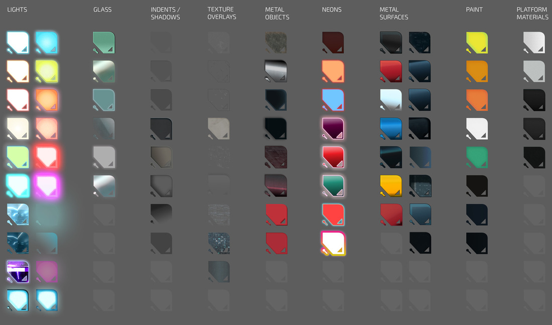 The Layer Style library I use for Spryke (click to enlarge) Combining Layer StylesHere you can see a step-by-step process of how I applied layer styles to one of Spryke's elements - a "Weasel" ship. The majority of layers are Vector Shapes (shown initially as wireframe). I add a few small raster elements in the last step. As you add Layer Styles to differently shaped objects, you may need to tweak them a little. For example, the angle of the red gradient on the wing needed to be rotated when applied to the tail. Similarly, the size of the glow of a large light might need to be taken down a notch when applied to a small one. Thankfully, the non-destructiveness of Layer Styles make this kind of fine-tuning pretty easy. Also, take note that in some cases, I couldn't achieve everything I wanted in one Layer Style, so I had to duplicate a layer and use more than one set of Layer Styles. This mainly occurred in the context of Pattern Overlays, the only way to import a raster image into Layer Styles. Photoshop only permits one Pattern Overlay per layer style, but I wanted three - a dirty texture, black scratches, and white scratches - so I had to use three identical layers, each with its own Layer Style. (I could have combined all three textures into one pattern, but that would have given me less flexibility.)  click to enlarge And here's one of Spryke's buildings. Again, practically every element is a Vector Shape with Layer Styles applied to it. (A few more Layer Styles were used than what is shown, but this is the bulk of them). 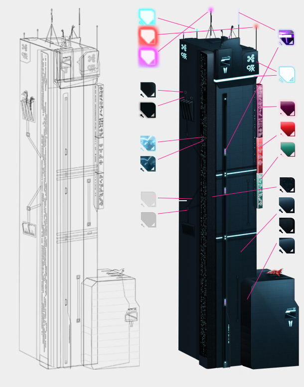 Layer Styles for versatilityBecause they're so tweakable and non-destructive, Layer Styles are excellent for creating variations of your assets, and even for early experimentation and brainstorming. 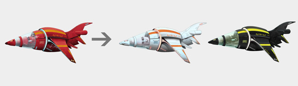 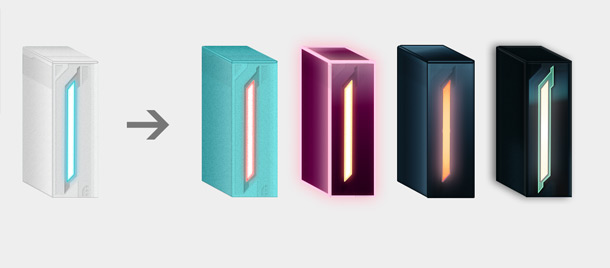 Layer Styles as internal Adjustment LayersSo far, I've concentrated on Layer Styles used on their own (ie. setting Fill Opacity to 0% so that none of the original layer contents can be seen). But Layer Styles can also be used as a quick and easy way of adjusting a layer's existing contents, as you would with an Adjustment Layer. Let's say you want to desaturate a layer. You could do Image>Adjustments>Desaturate (Ctrl-Shift-U), which is very quick but also destructive (you can't change your mind and revert to color later). You could also use a Hue/Saturation or Black&White adjustment layer. This is non-destructive (and in the case of Black&White, very nuanced), but it's also a little clunky: it creates a separate layer, and by default it'll desaturate all layers underneath it, not just your target layer. A third option is to use a simple Layer Style: Color Overlay, black (or white, or grey), 100% Opacity, Saturation Blend Mode. This is relatively quick, non-destructive, and has a light footprint in your Layers palette. And of course, you can save the Layer Style so you can copy/paste it to other layers later. Below are a few examples of possible adjustment types, including desaturation, contrast, colorize, noise, and brightness. Note that in the centremost version, I've used Satin to change the color of the circular metal area without affecting the rest of the creature (more or less). One of the benefits of this approach is that you can stack multiple effects using Pseudo Color Overlays (see next section) all within just one Layer Style, which helps keep your document compact. 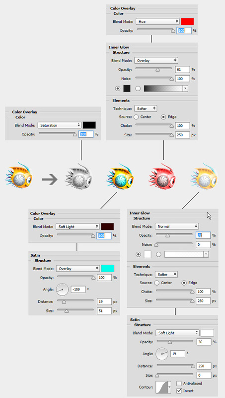 Spryke, shown with various adjustments, using Layer Styles Pseudo Color OverlaysUPDATE (24 June 2015): Photoshop CC 2015 has introduced the ability to use multiple versions of the same Layer Style attribute within the same Layer Style. So, we can now click a "+" button to get up to 10 Color Overlays at once. This is nice, and alleviates the need for Pseudo Color Overlays somewhat, though not completely. As of writing, you still can't rearrange the order of Layer Style Attributes. So, for example, if you want a Color Overlay that is applied over the top of an Inner Glow, or before a Gradient Overlay, you'll still need to use the appropriate Pseudo Color Overlays. In the next section, I'll go through each of the attributes with tips and tricks for each. But first I want to bring attention to what I've dubbed Pseudo Color Overlays. Color Overlay allows us to apply a colour to the entire layer, which makes it highly useful. Ostensibly, it's the only Layer Style attribute that does so. However, with the correct settings, a number of the other attributes can be made to function in essentially the same way. Here is a list of Pseudo Color Overlays, in order of quickest to most convoluted:
Let's imagine that we have a shiny blue spaceship that we'd like to make look a bit more aggressive: red, more starkly contrasted, and a little rougher-looking. Also, we want to do this non-destructively. We'll need to change the ship's color, add texture, and fine tune the brightness/contrast. With the Adjustment Layer method, this would require several new layers. But with Pseudo Color Overlays we can do it all on the original layer, a more compact and more portable solution. OK, here's our initial blue ship:  First, we use a Pseudo Color Overlay (Gradient Overlay in this case) to change the hue of the entire layer from red to blue:  That's a good start, but it feels too monochrome and maybe a bit too plasticky. Let's add a second color into the mix for nuance, using the 'real' Color Overlay this time. 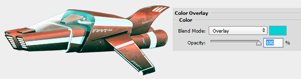 That's more interesting, though the addition of cyan tinges has messed up our reds (and whites) a bit. Let's counteract that by applying another reddish colour over the whole layer with another Pseudo Color Overlay (Satin, using the settings listed earlier). We'll use an Overlay blend mode again to boost the contrast: 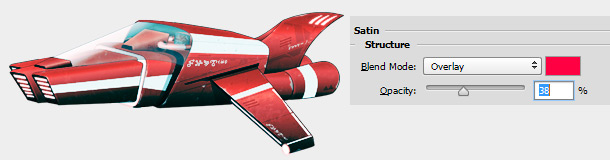 OK, the colour looks good. Finally, let's add a little bit of noise to the whole thing for a bit of a rougher texture, using Inner Glow. 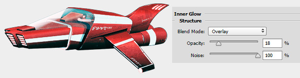 OK, there we have it. The method was perhaps a little quick and dirty, but the results are satisfactory. Our ship is redder, rougher, and has a sharper contrast. And, thanks to Pseudo Color Overlays, the whole thing was achieved with just one Layer Style which can easily be disabled, modified, or copied/pasted at any time. 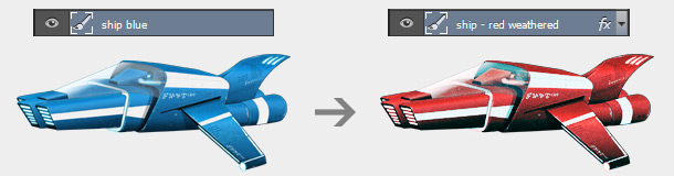 Tips & Tricks for each Layer Style attributeOK, I'll now provide a few tips, tricks, and potential pitfalls of each Layer Style attribute. I won't explain the basics about each attribute, because you can find those out yourself with a few minutes of experimentation, if you don't know them already. Bevel & Emboss
Stroke
Inner Shadow
Inner Glow
Satin
Color Overlay
Gradient Overlay
Pattern Overlay
Outer Glow
Drop Shadow
General Layer Style Advice
A final note about Blend ModesIn Photoshop, any pixel that isn't 100% opaque won't have its Blend Mode honoured when flattened or exported. Note that this issue isn't unique to Layer Styles. Take the following [somewhat ugly...sorry] example: 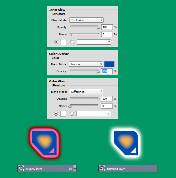 The shape on the left has a blue Color Overlay and a white Inner Glow and white Outer Glow. Because of the Exclusion and Difference Blend Modes, these glows appear magenta and yellow.
The shape on the right is exactly the same shape, but flattened*. Notice how the Blend Mode of the Inner Glow was honoured, while the Blend Mode of the Outer Glow was not. The Inner Glow was honoured correctly because it occurred on a 100% opaque portion of the shape, due to the Color Overlay underneath the Inner Glow. Had the Color Overlay been 50%, the yellowness of the Inner Glow would have persisted, but only partially. Had the Color Overlay not been there at all, the Inner Glow would have suffered the same fate as the Outer Glow. Namely, it would have reverted to Normal, and become white. * in this case, the shape was flattened by being converted into a Smart Object. You'd get the same result with Layer>Flatten Image, Rasterize Layer, or if you saved it as a PNG. That's it for the guide. I hope it's been useful, and happy creating!
8 Comments
Evan
29/5/2015 12:48:19 am
This is awesome! Thanks for sharing. I'm curious about how you made the wireframes before applying textures, did you start in illustrator and convert objects to layers? Illustrator seems to auto group parts of my object and then create about 5-10 layers when I really need about 100.
Evan
29/5/2015 01:01:01 am
Nevermind, I had to "release to layers (sequence)" THEN export to .psd. Thanks again for the article this'll be fun!
Elizabeth
15/10/2015 03:40:09 am
One thing I don't read in your article is how to change the stack order of layer styles in the Layer Styles dialog box. I thought you could just click and drag to rearrange the same way you can with the regular file layers, but it doesn't work. There's an up and down arrow at the bottom next to the "fx" flyout menu, but they are grayed out. Not sure if they're disabled and I need a plug-in to activate or what.
Jon
20/4/2016 03:46:58 am
I have a layer style I down loaded, how can I use the PATTERN on another style? 8/6/2017 03:28:44 pm
Awesome tips. Using the patterns is really cool. 22/11/2017 04:44:48 pm
A huge thank to you for this most needful tutorial.Thanks a lot for sharing. Leave a Reply. |
|

 RSS Feed